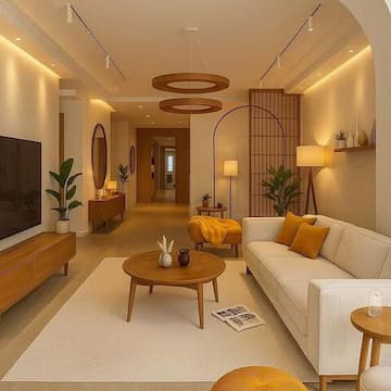
Colors have a profound impact on our emotions, mood, and even behavior. In interior design, understanding color psychology can help you create spaces that not only look beautiful but also support the activities and feelings you want to encourage in each room.
The Science Behind Color Psychology
Research has shown that colors can influence our physiological responses. Warm colors like red, orange, and yellow can increase energy and appetite, while cool colors like blue, green, and purple tend to have a calming effect. This isn't just cultural—it's rooted in how our brains process visual information.
Warm Colors: Energy and Warmth
Red: Associated with passion, energy, and excitement. Use sparingly in bedrooms (it can be too stimulating) but great for dining rooms where it can stimulate appetite and conversation.
Orange: Combines the energy of red with the cheerfulness of yellow. Perfect for creative spaces, playrooms, or areas where you want to encourage social interaction.
Yellow: The color of sunshine and happiness. Ideal for kitchens, breakfast nooks, and entryways. However, bright yellow can be overwhelming in large doses, so consider softer shades like butter or cream.
Cool Colors: Calm and Serenity
Blue: Known for its calming properties, blue is excellent for bedrooms and bathrooms. It can lower heart rate and blood pressure, making it ideal for spaces dedicated to rest and relaxation.
Green: The color of nature, green promotes balance and harmony. It's versatile enough for almost any room and works particularly well in home offices where it can reduce eye strain and create a sense of calm focus.
Purple: Often associated with creativity and luxury. Lighter shades like lavender work well in bedrooms, while deeper purples can add sophistication to living rooms or studies.
Neutral Colors: Versatility and Balance
Neutrals like white, gray, beige, and black serve as the foundation of most color schemes. They provide balance, allow other colors to shine, and create a sense of sophistication. White can make spaces feel larger and cleaner, while gray offers a modern, sophisticated backdrop.
Practical Application Tips
When choosing colors for your home, consider the function of each room. Bedrooms benefit from calming blues and greens, while kitchens and dining areas can handle warmer tones. Don't be afraid to use color psychology as a starting point, but always trust your personal preferences and how colors make you feel.
Remember, the same color can have different effects depending on its shade, saturation, and the amount used. A bright red accent wall will feel very different from a muted burgundy throughout a room. Experiment with samples and see how colors feel in your specific space with your lighting conditions.